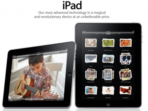
Yeah, the iPad looks cool. It’s “new” and “cutting edge” and “beautiful”. But the product launch could have been better, and Steve, in all of his holiness dropped the ball. Here’s why:
During the unveiling lots of sites ran live blogs and some (Huffington Post) even live streamed Job’s presentation to the masses (probably using their iPhones). On one such channel there were almost 90,000 viewers. But the quality was terrible.
Images were grainy, washed out, the audio was shit and any of those superlatives used to describe the new product were lost in translation, quite simply because there was zero production value for those that were transferring information from the live session to the millions of waiting fanboys and -girls across the US (and a fair number of moderately interested tech junkies as well). All I could see was a skinny dude in a black turtle neck walking around on the stage in front of a huge blurry back drop. I’m guessing that it was Steve.
For a man, company and culture which pride themselves so much on aesthetics, why the hell would they limit a nice crystal view of the unveiling to a few 1000 (if that), then invite the masses to watch sub-par documentation via camera phones and live streaming with additional (annoying) unofficial commentary? And if the answer is “people covered the event with our own technologies (e.g. the iPhone with live streaming capabilities)”. Well, then your products suck too.
I expect more, Steve.
The iPad in it’s glory:

